We had decided on the name of the magazine which was 'The Cut' this was because we felt it would attract our target audience in the sense it was a strong, sharp name with a double meaning. It relates to film as our films are cut when making and editing them also it could be referring to the storyline of the new film release enticing the audience to view it to see what the outcome is. The dark clothing and posture of the characters also amplifies vunerable and scary atmosphere of the cover. To darken down the left hand third of the cover we used the burn tool and selected the areas we wanted to have darker. With the help of photoshop we lightened the face of the victim to highlight her worried expression.We brightened up the female protagonist (the victim) to make her seem innocent and make her seem vulnerable intriguing the audience.
Sunday, December 12, 2010
Editing process

Here is a screen shot image of the footage we edited together. Whenever we finished each session of filming we would upload the footage onto premiere pro, from there we would select which shots we prefer and are suitable for our horror trailer. We would then drag these down into the work area (the bottom mid panel), we then edited them individually, making sure that only the parts of the shot we needed remained. When we started off filming we didnt get that much done as we hoped, as there was some issuseswith the filming. So as we were organising more filming we decided to use the time we had for editing wisely. We added lighting and in some instances speed, duration, special effects to the shots we had. We did this using the drop down menu on the left hand sideof the screen, one of the effects that we used on the majority of our shots was the brightness and contrast. This allowed us to darken down shots, so we could portray more of an eerie, chilling atmosphere, as it is sceen in horror films and trailers. Obviously we followed our group storyboard, however the detailed list came in useful as some alterations had been made between the time the storyboard was completed and when filming took place. After this day we uploaded all of the footage and did as we had before, dragging down the shots we wanted and cutting them down individually. Then using the list we began to order the shots and also uploaded out soundtrack. The shots that were going to be quickly cut together at the end of the trailer (to represent the falling action) were left in a 'random' arrangement until the rest of the shots had been put into a suitable order. We used many black 'still title' slides to add captions throughout. We altered the scale of the text as the slide was played so that the text 'grew'. Once we had the basic structure of our trailer in place it was time to tweak and improve certain shots and sequences. We also had to cut the soundtrack right down as to begin with it was over 3 minutes in length and our trailer would be no longer that 1 minute, 30 seconds.To do this we used the Razor tool on the right hand side of premier pro and marked out the sections we needed to cut out. This was a very difficult and time consuming process as we needed to match the previous piece of music cut with the next. This needed to be perfect so that the audience would assume the song was fluent and sounded correct when played to our trailer. Although this was frustrating and errors were made at times we learnt how to better our new skill and edited our song to how we wanted it to sound. We then began to move our shots to fit the track. We left a couple of gaps in our trailer where we needed to film a few more shots when begining to finish our trailer, we new we had to film these it was just a matter of arranging time for the protaginist to act for us. Once we had filmed these final shots it was easy to slot this in to place, and adding our last affects to these final shots. The last few days of editing our trailer were very stressfull as we had to completly re edit our sound track as the tempo rose to earlier in our trailer according to our shot layout. To overcome this issue we repeated the first part of the soundtrack at the begining of the trailer which was the rising action, this alllowed the pace to increase at the correct point in the trailer.
analysis of film posters

The fuzzy style writing as well as the time an the picture of the film indicates that it is a film recorded on a video recorder camera. The picture is also in a house showing the target audience that it is a home made video. The baby is grabbing onto the cot creating a sence of fear and terror, also the dog is barking showing the target audience that something or someone is their, this creates tention and suspence as you dont know what is there.The text is blurry and is a deep red colour creating a horror effect. The unusual text sends a thrill to the audience as the colours used are associated with blood and death. The dark image and black background shows that the film is centred around darkness, this tells us the genre.When you first look at the poster you instantly focus your eyes on the centre, this gives the effect that we are not the only ones watching the charecters. The quote about the film sends shivers throught the audience as they are warned their sleepness nights are about to return. The poster not only indicates it is the second film but making the audience excited to see what happens to make them experience sleepless nights again as the lasrt film did.

The image used a closeup of a woman's face, with a person's silhouete in the background is very powerful. The main actress' name spreads across the width of the page in white text. The use of white enables the text to stand out against the dark background. As Jodie Foster is a well known actress, her presence in the film may alone attract the audience. At the bottom of the poster, beneath the title, are the names of the crew and cast this is often seen in film posters. This poster has a simple colour scheme of black, white and red. Only the film title, panis room and the words coming soon are in red. As the rest of the page is in black white grey these two text are extremely prominant. This is vital as essentially the film title and release date are most important when promoting a film. The use of the word panic and the poster image clearly represent the film as a horror.
analysis of magazine covers

Empire is one of the most famous film magazine. On their covers they have the latest films advertised, for example Harry potter and the deathly hallows. This attracts the audience as they like to be kept up to date. The masthead is in a bold red colour, the magazine usually has the same font and colour for every issue to keep a house style. There is a smaller image placed on the bottom of the left hand side of the magazine. This shows that this image is importanat to this issue. The words 'massive preview special'are in a larger font than the rest of the coverlines. This is due to it being an exclusive preview of a upcoming film. This attracts the target audience as they love having the chance to win something. Their is a stapline used at the bottom of the magazine, they have advertised an upcoming movie that the target audience would be interested in. This is intriging the audience and getting them interested. Their are some coverlines on the left hand third, these are placed here as in case the magazine is placed on a horizontal shelving system.

On this magazine it is quite busy, however still appears neat, The coverlines are positioned in line with Megan Fox, which helps to highlight her importance. Words and phrases such as hot and the most wanted woman in Hollywood help show the idea of sex appeal. There is a main colour scheme of blue, grey, black and white. The other feature photographs in the bottom left corner also contain these colours. The bold title however does not comply with this colour scheme and is instead in a vibrant bright red.The main attraction of this cover is its sex appeal. Megan Fox is a well known actress and sex icon. Her bare upper body and tight leather trousers, along with her pose and expression, not only portray her in a sexual manner but the image also has an element of vulnerability. Clearly this will appeal to the male members of the audience, but also any females are likely to find this appealing as they may idolise her.
problems with filming
When we were filming out trailer we did have a few problems. One of the problems was trying to avoid the ad weather, so sometimes we had to finish early, this meant that sometimes we didnt get the right amount of filming don that we wanted. Another problem was the lighting in some of our shots due to the time of day we filmed. In some shots we filmed after school at around 4pm, due to the time of year natural light was oftern poor. For this reason some shots appeared grainy, this meant that we could not use it in our trailer. The main issue we had was trying t get all the people that were acting in out trailer together. We about 7 people to act in outr trailer and several shots involved all of them. it was very hard to find a day when everyone was availible to film and so there was a relatively long period of time when our group had littel footage to edit. When we had a day when everyone was free we had to make sure that we filmed everything that day, as it would be a problem getting everyone together again.
Sunday, December 5, 2010
Filming locations

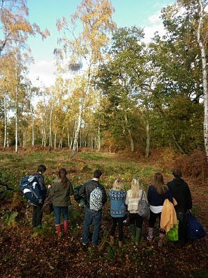
Above are the some of the locations that i have taken pictures of, that will feature in our final trailer. We are using a range of locations for our trailer to keep to the audicene interested as well as looking realistic as a film wouldnt use for example a single shot of a location throughout the whole of the film. As our trailer is based around a camping trip we will be using specific props within our trailer again making our trailer believeable to the viewing target audience.Our main location is set in the woods where the most action and chase scenes will occur. By setting our main location in the woods the audience will associate this with a horror trailer as this type of location is used frequently in these genre films.
target audience
Our target audience are people who enjoy horror movies in general but also are interested in other film genres. It is aimed at horror fans who like fast paced thrilling quick editing to make the viewer feel jumpy and on edge throughout.Our trailer is aimed at both females and males and this will be shown clearly in our trailer which will include both genders. This will be shown in our trailer through the characters clothing, the background music and the general mise en scene. To make our trailer stand out from other horror films we are using various locations with different angled shots and lighting which can also be edited on the editing software. In horror trailer and films the characters tend to wear dark clothing to emphasise the scary Ora, we will be incorporating this in our film trailer so the audience can recognise the genre along with the dramatic background music.
Subscribe to:
Posts (Atom)